What a body fat chart shows
A body fat chart visually groups your percentage into categories such as:
- Essential fat
- Athletes
- Fitness
- Average
- High body fat
These ranges vary between men and women because hormonal and biological differences affect fat distribution.
Typical healthy ranges
| Category | Men | Women |
|---|---|---|
| Essential fat | 2–5% | 10–13% |
| Athletes | 6–13% | 14–20% |
| Fitness | 14–17% | 21–24% |
| Average | 18–24% | 25–31% |
| High | 25%+ | 32%+ |
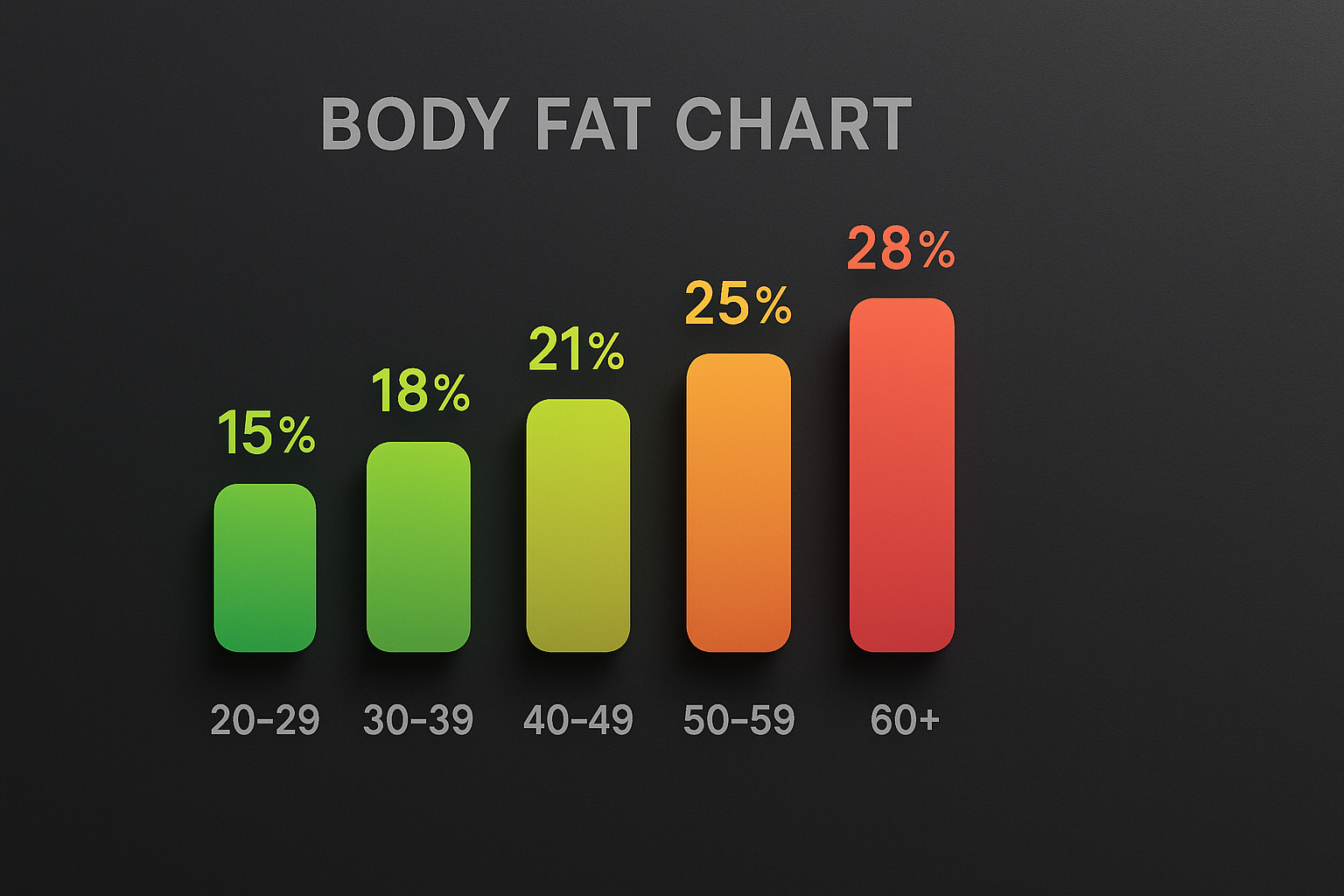
Why charts include age brackets
Body fat naturally increases with age. Charts often show groups like 20–29, 30–39, 40–49 and so on. The healthy range rises slightly in each decade because metabolism slows and lean mass tends to decrease.
Color coding in body fat charts
Most charts use color cues to make interpretation easy:
- Green: fitness or healthy range
- Yellow: slightly above average
- Red: high body fat range
The color bar helps you quickly see where your measurement falls without needing to study numbers.
How to use your result
The most helpful way to use a body fat chart is to track movement over time rather than obsessing over single numbers. Taking measurements consistently every few weeks shows a clearer trend.
If you want a more personalized reading, use the calculator on this site and check the chart in the results page.